We are in need of a logo for our website with the name ‘The Participatory Economy Project’.
Do you have graphic design skills? Or do you know a graphic designer who might be interested in helping? Do you have any ideas or suggestions? Please submit your logo design here. If you have any questions, please ask below.
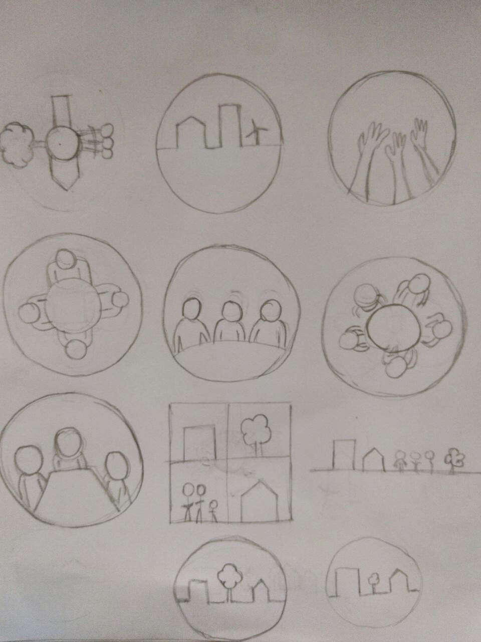
The direction you have taken is primarily with meetings. Below I have taken the direction of nested federations. I like your sketches I think they need more refining and simplifying. I think the one with the hands in the circle (which to me represents a worker or consumer council) has the most potential. Maybe it could be streamlined down to one hand?
Thanks for sending the logo through Thomas. I like it.
Which ones do people like so far?
We will do more rounds of sketches of concepts.
Although I like the direction of just the council federation, for me I think the most successful concept is having a hand (representing participation) within maybe a circle (representing a self-managed nested council). More basic sketching and refining needs to be done now.
I was involved in CAPES (the Chicago Area Participatory Economics Society) and we had a website that featured this logo:
The idea was to have five arms mutually holding one another in a sense of cooperative solidarity. The five arms represented the five SEEDS values of a participatory economy (solidarity, equity, efficiency, diversity, self-management) and the five main institutions of a participatory economy (public ownership of the means of production, balanced jobs, remuneration per effort/sacrifice, self-managed worker and consumer councils, participatory planning).
By the way, the old CAPES website is no longer online, but snapshots of it were captured by the Internet Archive. Here’s one such snapshot for folks who may be interested:
I like the very last one Chris posted a lot; it’s clean, straightforward, and I like the idea of having the circles representing the federations. However, I also think it’s unlikely that new people will understand the symbolism. You would need to read the proposal before understanding there’s a nested structure of councils and federations etc. Only at that point would the imagery make sense. Therefore, I agree that having some kind of human imagery (people gathered together, the hands raised, arms holding each other etc.) is probably the best direction to immediately queue folks in to the spirit of the project.
If we do this in two steps. First decide on which concept/direction we like the most. Second step, we can then do more refined versions of that concept with colour and detail.
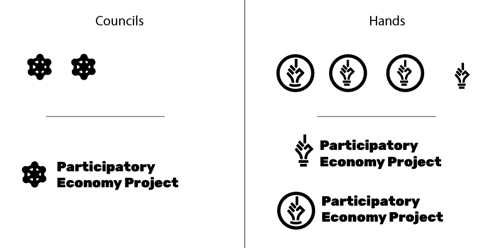
Which concept do people like so far? I like option 2, the raised hand the best, the silhouette of someone raising their hand I think is simple and very clearly conveys the theme of participation.
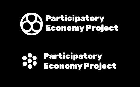
Yes, the symbol will be partnered with the text for the main logo. We will have different versions of the final logo to use in different settings, e.g. horizontal, vertically stacked, on dark and on light background, symbol on it’s own for social media profile images, etc.
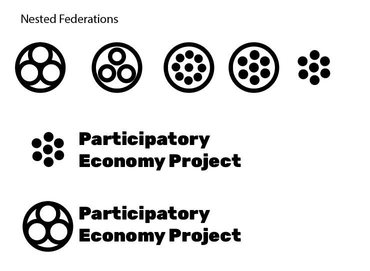
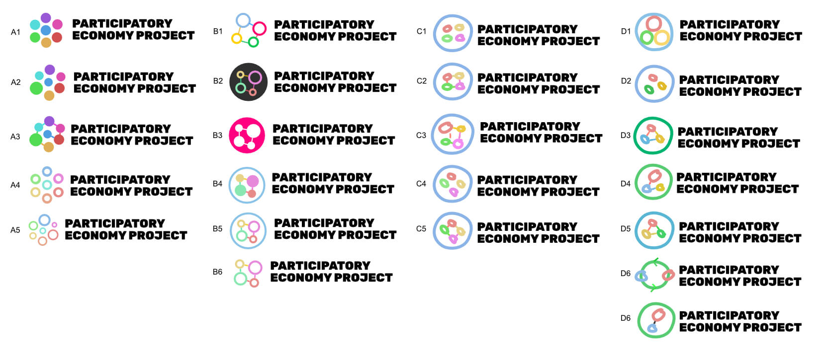
I like Option #1, particularly those entries with just three circles. Entries with a prominent center circle may give the impression that the center is more important, and I don’t think we want to give that impression.
Personal I think the councils and the hand concepts have the most potential. We need to do lots more iterations and sketches to nail down the right one.
I think it would be a good time now to get an idea which basic logo concept people like most so far out of those put forward. Remember, these are just rough concepts and we can work on more detailed versions of a concept in the next stage of the process.
Choose up to 2 logo concepts you like most. Please also say your reasons.
I think the councils and the hand/s have the most potential. Economy is too general and Meetings are not nice to provoke in people. Councils you can come up with a really simple logo that symbolises the federations. Hand makes it more human and symbolises participation/ Self-Management but is hard to get right.
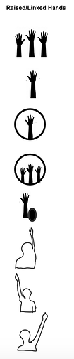
A middle finger logo. Now that that’s a logo that would definitely get some attention! maybe not that type we want though
I take your point and I agree that we should avoid a finger up design for that reason, but there are other ways of designing a hand up to signal participation, e.g. a whole hand up like these below. I think the hand up concept is my favourite so far because the symbolism is very clear to anyone what it means: participation. I also like the councils but the meaning is less obvious to a new audience.
I would prefer a hands up logo or something similar that puts the focus on participation because its closer to everyone’s anger for not having and longing for finally having a say about one’s individual and social and economic life and fate.