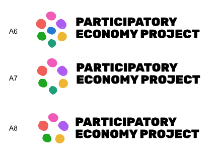
Of those options, A1 is my favourite with all the equally sized dots, but perhaps without the central(planning) dot? And maybe with the links from the other sets.
I like B2 best. I worry that we have 4 spheres of social life in our "overall social theory framework. So if these are worker councils, consumer councils, and federations then having a number that is NOT 4, and having them different sizes makes sense to me.
BUT MOST IMPORTANTLY: MY VOTE IS FOR SALE TO THE HIGHEST BIDDER.
I still like the colored writing the most and would prefer the writing in color and the symbol in black. What do you think?
For the symbols I would go for A5!
I vote for A1. Simple, distinctive, colorful, easily my favorite in the group.
I like the more hand-drawn style of C and D. It feels more organic and participatory. I’ve applied that style to theme A here.
1 Like
I think we can have different versions of a final logo, like Black & White and in different colours and colour backgrounds depending on which medium we use them on.
1 Like
I like theme A best.
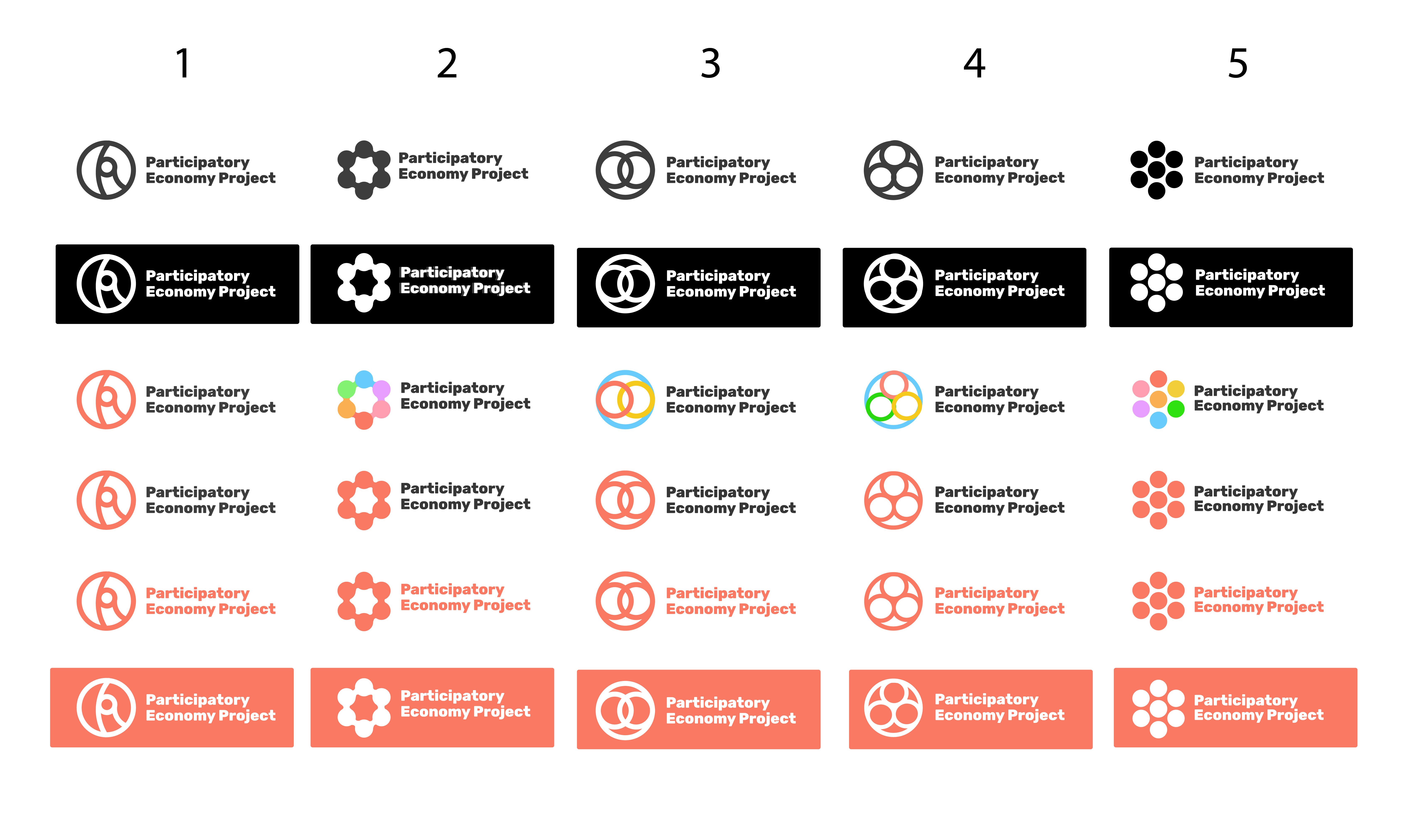
There were some strong preferences against the last logos. I have done another round of logo concept ideas (not refined) on the themes of participation and economy. I have listed them in order of my personal preference. Please let me know your feedback or feel free to submit any ideas you have.
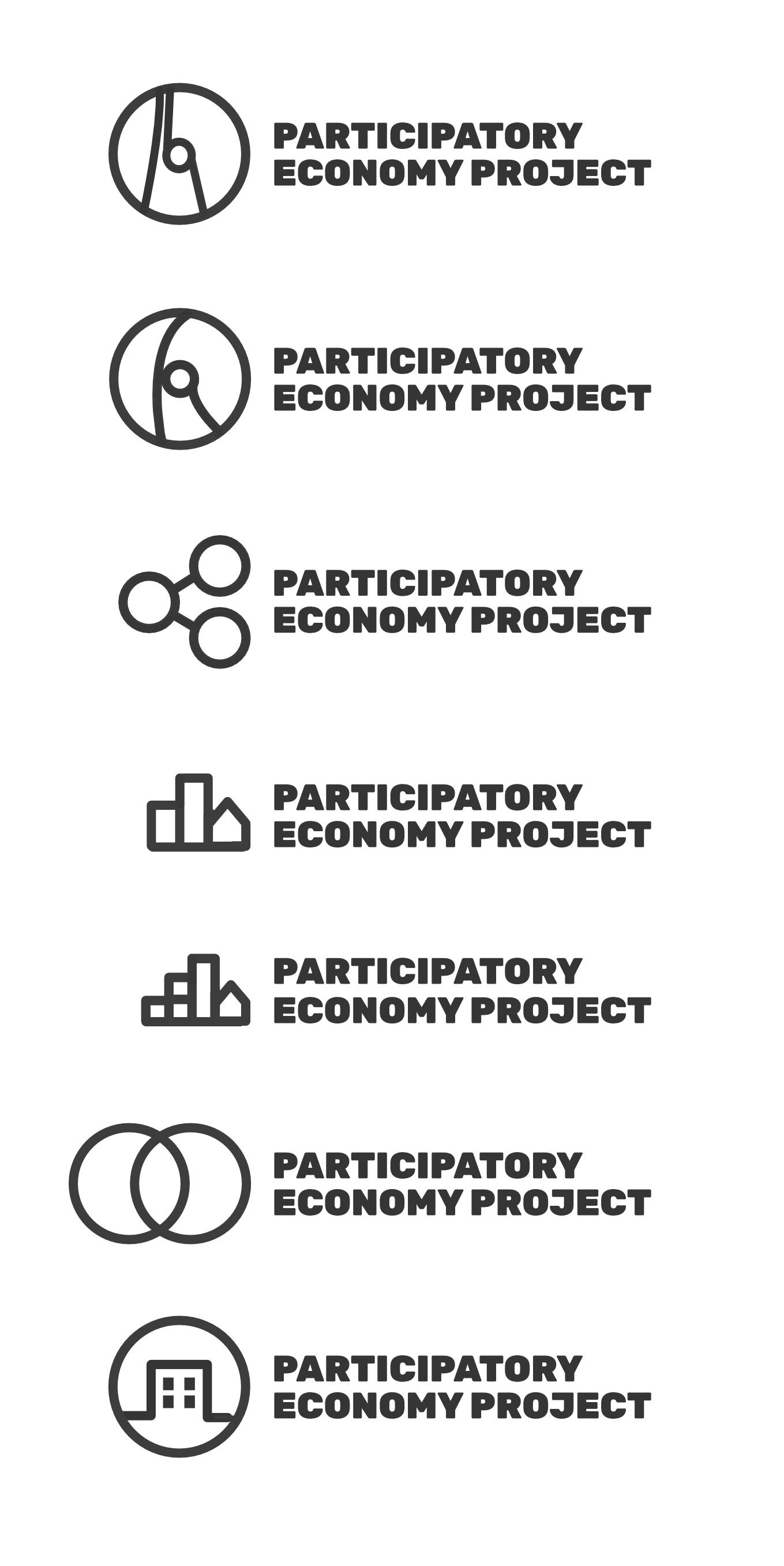
Out of the new batch I like the third one the best, but I feel like the image should be more in proportion with the text? The building ones afterwards are similar in size to the text and I like that!
I like the second one best. But that is a mild preference over number 1 and number 3. I have a strong negative preference for all of them with buildings.
But, as I’ve said for many months, I think choosing one soon is more important than further search for the perfect logo.
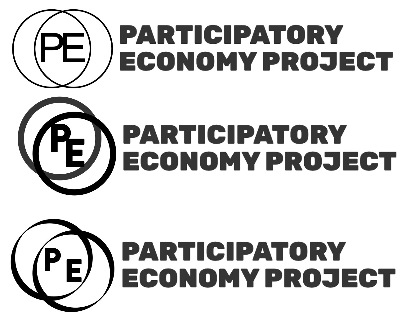
Couple letter-based logos I came up with quickly, any opinions? Like Robin I think the first three by Jason are best and I my favourite is number 2 as well. Third one is a bit bland and rest don’t fit that well.
In any case, couple logos based on letters sil vous plait.
I agree with Michael. I vote for Option #3, the one with the three circles connected by two lines. I recommend avoiding Option #5; it looks too much like the logo for the credit card Mastercard.
To make it a bit more difficult I would like to post one improvement of the writing I have already posted. It should be better readable and I like the colors. They illustrate the magnificence of Parecon.


I’d prefer the first one of yours!
From these I would prefer the third one.
The third one of Antti’s, but with a bit of colour would be nice, though no strong preference. Of Jason’s I like the two circles best, the first two are like asking for permission, the buildings remind me of corporations, 3 circles reminds me of a share icon or network. The ‘Mastercard’ one then by a process of elimination.
A final round of versions from me, based on feedback so far.
(I include example colours. Doesn’t need to be in red)
The last thing I want to do is delay the final decision on choice of a logo. But I DO like these ways of writing “Participatory Economy” and think we can make good use of them for various materials going forward. I wish AK Press had these available when choosing a cover for A Participatory Economy! Ah well… maybe next time.